A Case Study: What Makes Data Beautiful?
They say everyone has their preferred medium for learning — a unique pathway that resonates with their individuality. For me, that pathway is visual data. There’s something alluring about the way information unfolds before your eyes, captivating your senses and offering profound insights in an instant. While sifting through 20–50 page research papers, it’s common to glaze over the sea of words and be drawn to go straight down to the diagrams, tables, and charts — the artistic expressions of data. These mesmerizing visual representations hold a power that surpassed the confines of language, making knowledge so much easier to hold.

The captivating allure of data visualization is truly undeniable. Its remarkable ability to distill complex concepts into elegant and simple representations has always fascinated me. In fact, I find myself constantly embarking on my own personal journey of exploration, seeking out new and exciting ways to illustrate and showcase data. What’s incredible is that my fascination with data visualization extends far beyond mere inspiration; it has transformed the way I approach learning, and makes it fun.
When learning how to present data effectively, one word resonates above all: story. It needs to give purpose and direction. Every visual representation of data should stitch a compelling narrative — one that analyzes, supports statements, or presents evidence in a meaningful way.
A well-crafted data presentation begins by identifying the story we want to tell. Is it analyzing a phenomenon, uncover trends, or explore relationships? Is it gathering evidence to support a claim or communicate the impact of some findings?
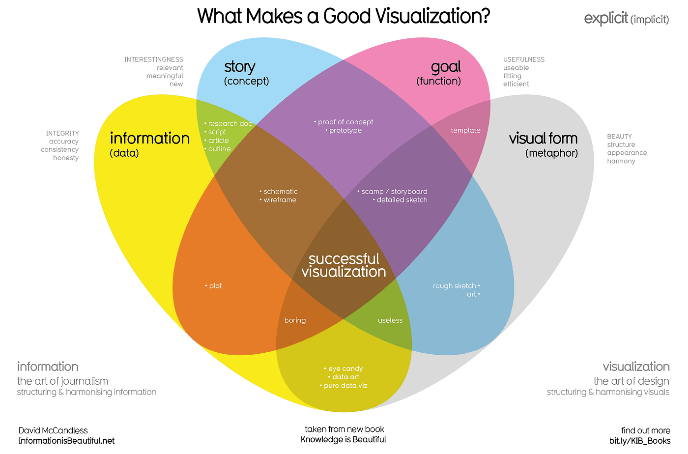
Personally, David McCandless “What makes a good visualization?”, illuminates the essential principles of effective data presentation. McCandless provides valuable insights into what works and what doesn’t in the realm of visualizing data, offering a roadmap for creating impactful and compelling visualizations.

McCandless’ work serves as a valuable guide for aspiring data storytellers, reminding us of the power and responsibility we hold in presenting information visually. By embracing simplicity, clarity, narrative, and aesthetics, we can create visualizations that not only communicate data effectively but also captivate and inspire our audience.
The artistry lies in transforming raw numbers and statistics into a coherent and engaging narrative. Each visualization becomes a scene, where data points are characters that interact, patterns unfold, and insights emerge. The visuals serve as the stage, enhancing the story’s impact and making complex concepts more accessible to our audience.
There’s a thrill in deciphering the hidden stories that lie within datasets, and finding creative ways to bring them to life visually. Whether it’s through captivating infographics, immersive interactive visualizations, or beautifully designed charts and graphs, the act of visualizing data becomes an adventure in itself. It’s a means of discovery, where every visualization holds the potential to uncover new insights and deepen our understanding of the world.
This is also an excuse to share recent visually exciting plots of data, and to show a couple and why they are attention-grabbing.

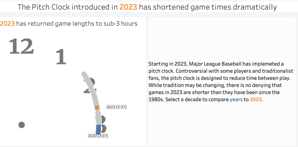
I don’t follow baseball super closely, however, this interactive clock that beautifully visualizes the duration of a baseball game. This innovative approach immediately caught my eye and piqued my interest when I first saw it. The clock becomes a canvas, as it provides a dynamic representation of the game’s duration.

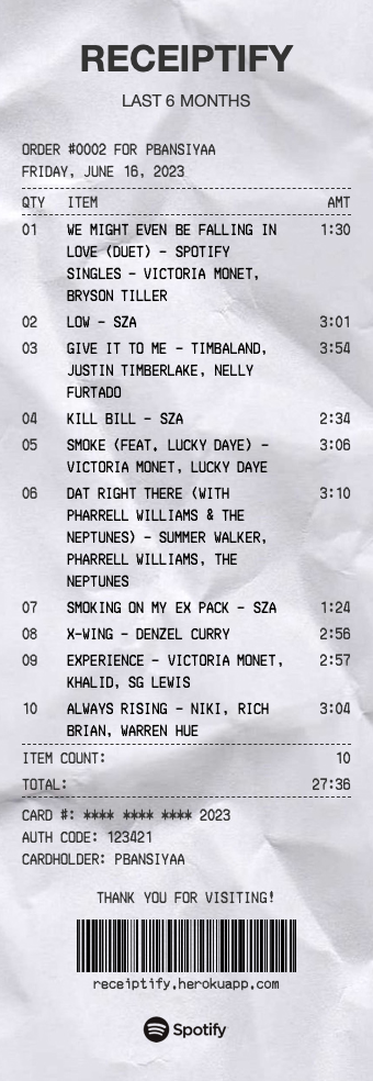
Receiptify has become one of my favorite sites to come back to every couple of months, providing a delightful way to visualize my most-played songs. Its unique approach adds a touch of fun and excitement to the experience, making it highly repostable and share-worthy. What sets Receiptify apart is not just its functionality, but also its charming design and realistic details. (not to mention the crumpled look!) The cute and playful visuals bring my listening habits to life in a way that feels personal and engaging.
Above all, the beauty of data visualization lies in its subjectivity. Every person has their unique perspective on what makes data exciting and captivating. We all have our preferences when it comes to styles and designs that facilitate learning and make the journey more enjoyable. It’s the magic of personal connection and the sense of wonder that accompanies the discovery of something new. What truly matters is that these visual representations have a special quality — an ability to make learning a little easier and more accessible.
For me, data visualization has become a powerful tool not only for communicating information effectively but also for making the process of learning truly enjoyable. The blend of aesthetics and knowledge creates a harmonious blend that sparks curiosity and fuels intellectual curiosity. It transforms the seemingly mundane into a captivating experience, where learning becomes a delightful journey of exploration.
